Exploring Texture
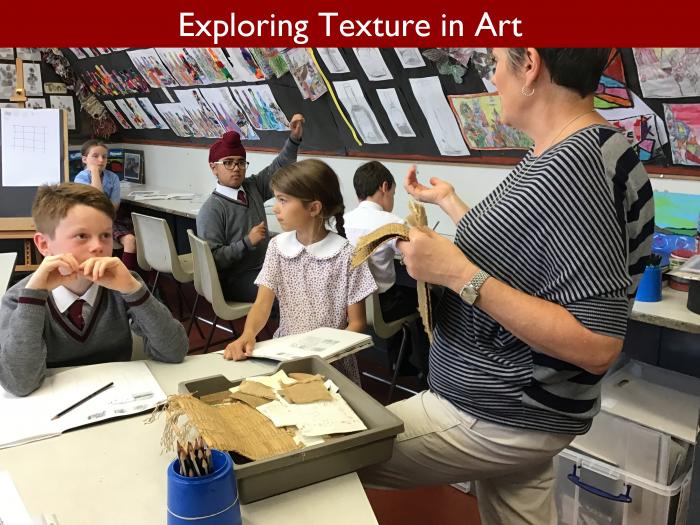
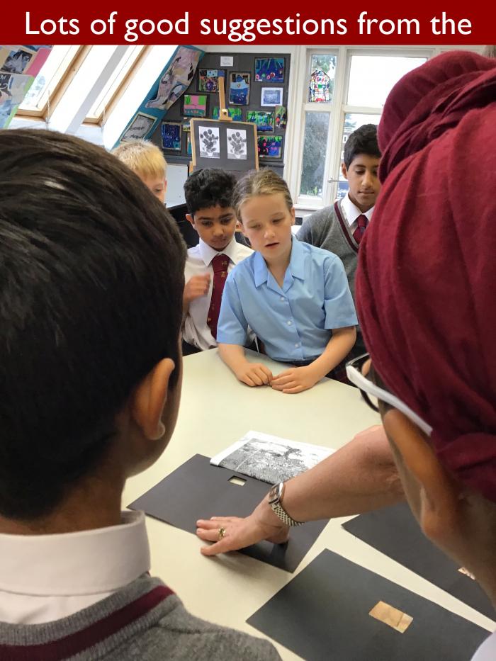
Even on a drizzly early autumn morning, the art room at Eversfield is a bright and uplifting place to be, so for the first blog of the academic year, I was keen to join Mrs Beech and 5GH to learn about how drawing skills can be improved by the careful use of texture, tone and pattern.
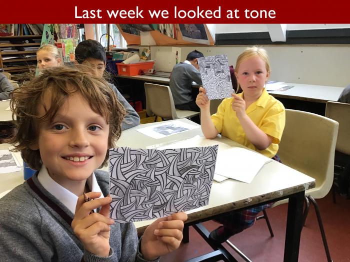
Last week, the focus was on tone, which is primarily achieved through varying pencil pressure. The children worked on a graded tone design for inclusion in their sketchbooks. This lesson, however, Mrs Beech wanted the emphasis to be on texture, and for the children to understand the clear but subtle difference between not just tone and texture but pattern, too. Malakai found words to explain the difference succinctly. Pattern has to be done in a certain way, he said, but texture is freestyle.
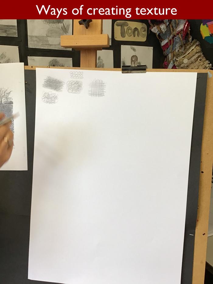
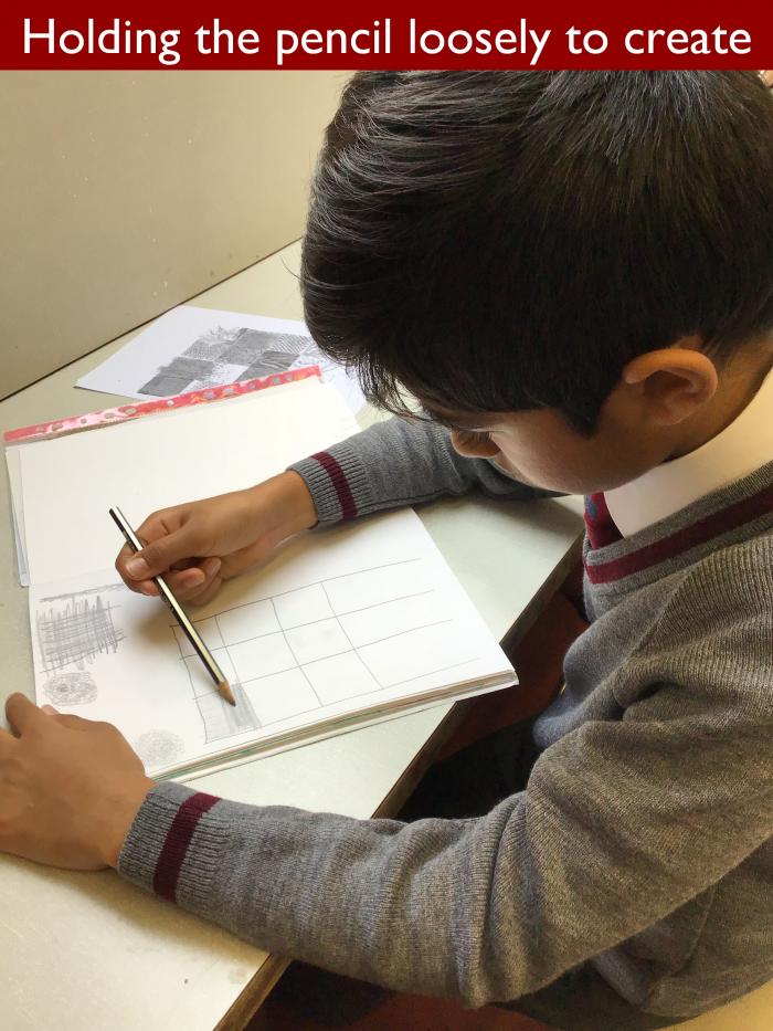
The lesson began with the children using their pencils to experiment with controlled scribbles as a way of creating texture in their work. Mrs Beech showed the class how to start by applying a base layer and then to add texture by manipulating the pencil, for instance by making circular movements or by cross hatching.
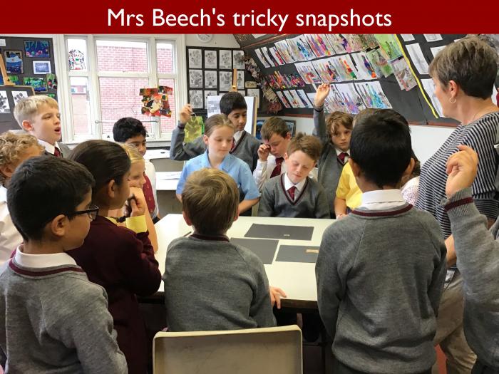
To encourage the children to think creatively, Mrs Beech next showed them three tiny snapshots of pictures where texture has been used to great effect. Seeing such a small fraction of the image enabled them to focus on the texture and sent their imaginations soaring in different ways. Swirling lines suggested bushes for Zakir and made Seve think of a stream, yet the picture turned out to be a black and white drawing by Van Gogh of a mulberry tree. The second picture was in colour, and that influenced the children’s thinking possibly even more than the texture. Brown tones suggested sand, or maybe a kitchen floor tile, so everyone was amazed when Mrs Beech revealed the image of a face. Focusing on such a small detail within a picture certainly opened the children’s minds, and it also made it easier for them to understand what a time consuming business it can be to develop texture in a drawing or painting.
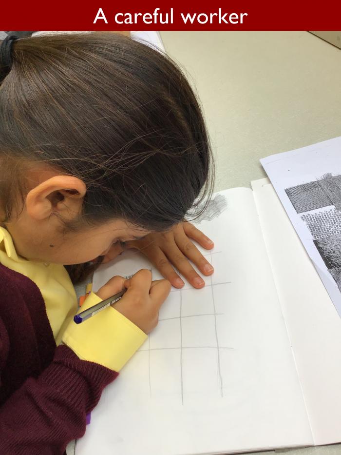
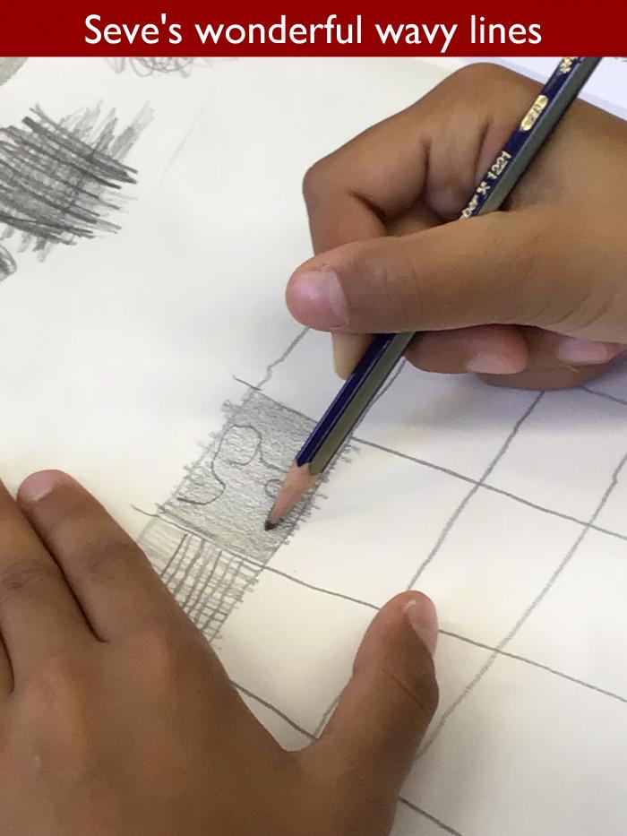
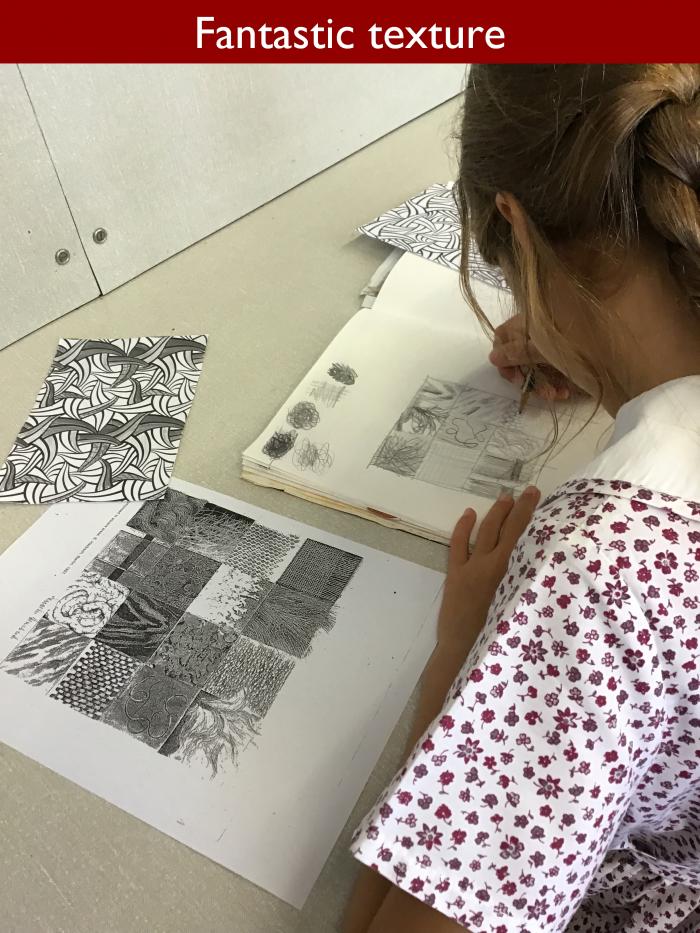
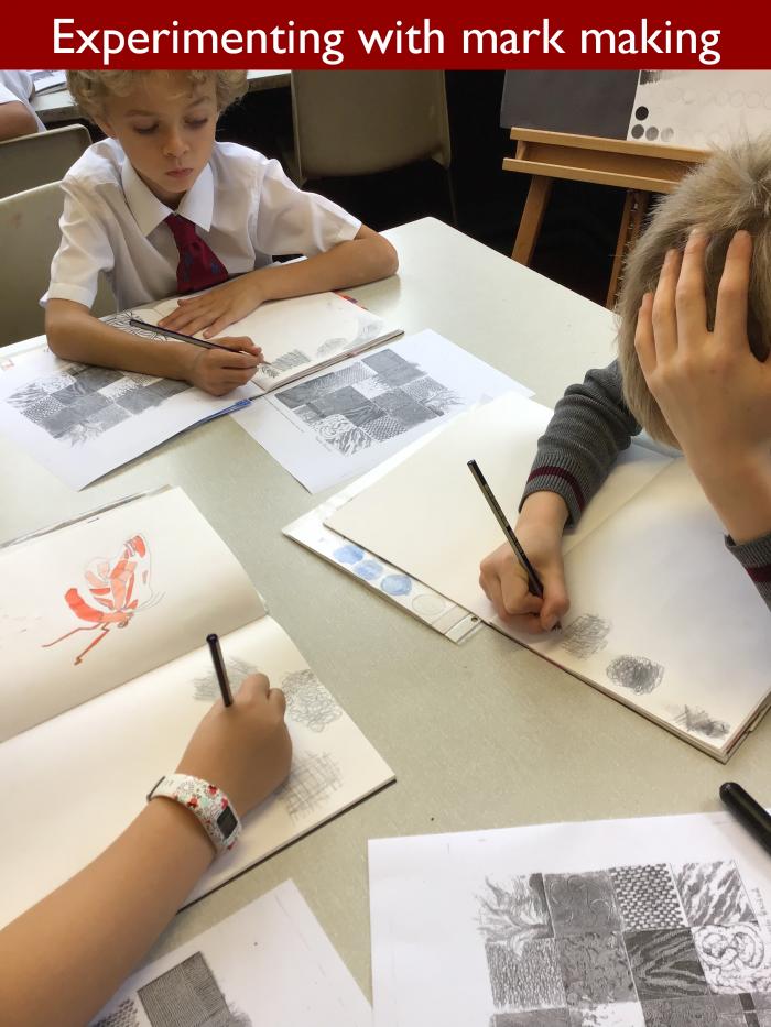
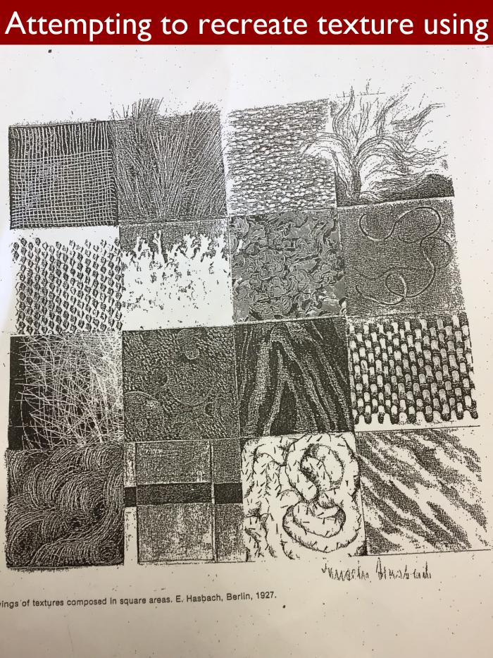
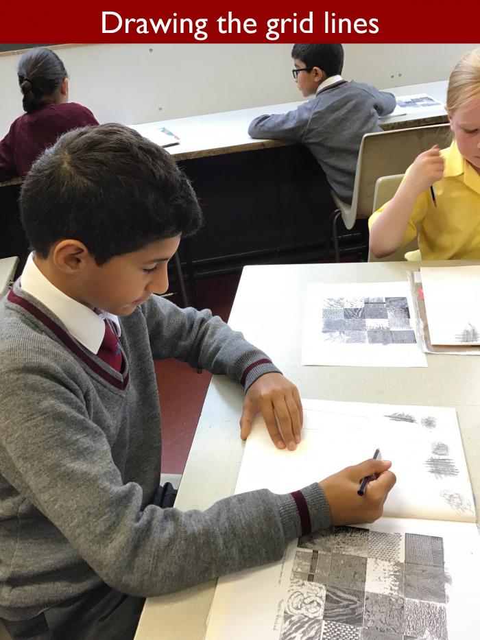
The children were provided with a bank of black and white textures which they had to reproduce within a grid drawn in their sketchbooks. After applying his base layer, Seve took immense care to overlay it with a series of delicate wavy lines. Henry, meanwhile realised that he needed to employ a mixture of tone and texture to achieve the precise effect he wanted for his work.
Mrs Beech’s advice to the group was to avoid heavy lines at all costs and also, very importantly, not to worry about going wrong. Rubbers are not allowed in the sketchbooks, and Mrs Beech encourages children to embrace their errors and learn from them. Wonderful things are made from mistakes, she insists, which is as true in life as it is in art but not, unfortunately, in my kitchen.
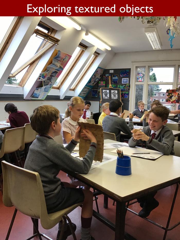
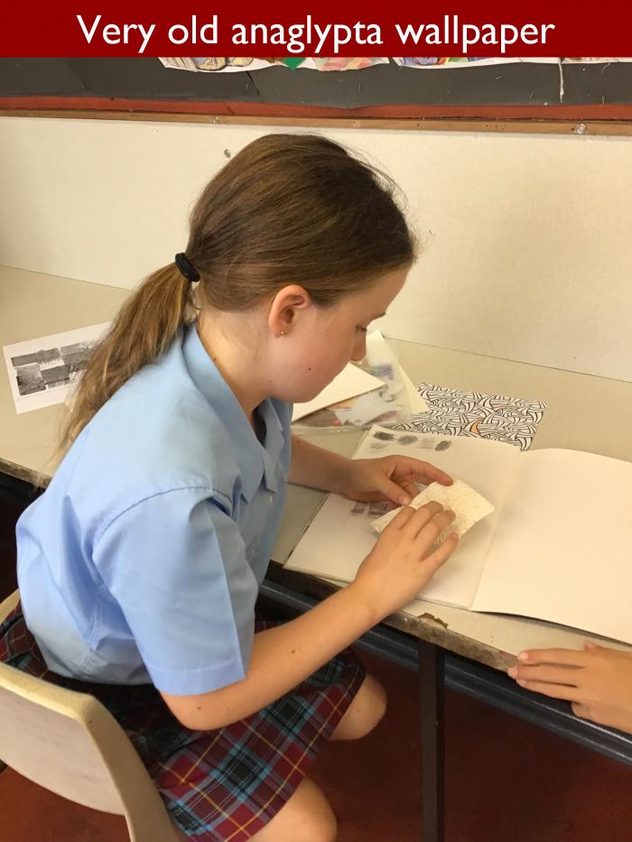
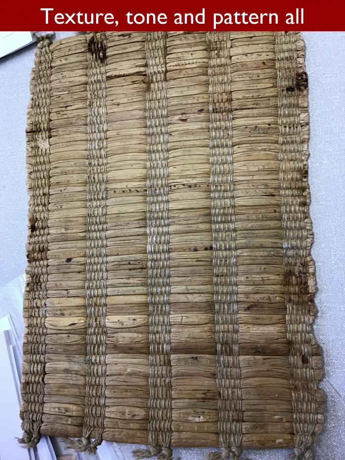
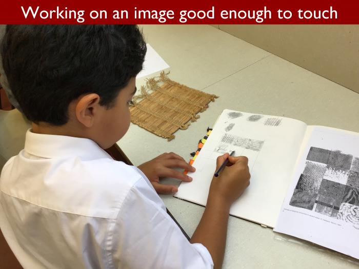
Moving on, Mrs Beech produced a tray full of textured objects, which she wanted the class to explore with their fingers. Chloe was puzzled by an ancient fragment of anaglypta wallpaper. Other children were fascinated by the abrasive feel of sandpaper and the relative smoothness of its reverse side. For Mrs Beech, the question was how could these textures be represented through drawing. Malakai thought he had the answer where sandpaper was concerned. Darker tones and textures would show the rough part, with a lighter hand required for the smooth.
During the course of the lesson, Mrs Beech took 5GH on a journey from looking at texture, to feeling it, and finally to considering how to capture its essence on paper. Next week, the children will be employing all the skills they have learnt so far when they attempt their own version of a sketch by Van Gogh.